St Mark's Hamilton Terrace - a Church with Mosaics
St Mark's, Hamilton Terrace.
St Mark’s Hamilton Square is of interest to these pages for its excellent collection of mosaics. Alas, after a fire on the night of 27 January, 2023, the Church has been gutted. The Vicar, the Revd. Kate Harrison, is quoted in the Church Times (on this page) saying that from what she had seen, all the interior decoration had gone. 'The gorgeous mosaics that were on the walls have gone, the Victorian pews have gone, the gallery has just disappeared, the organ which was up in the gallery has disappeared. It looks like it’s been hit by a bomb. It’s a shell, with huge amounts of debris inside.' This page shows some of what was there - click any picture to enlarge; I have put larger size pictures than usual on this site, as the originals are likely lost, and I took the pictures with the light shining upon them, as this is how Italian smalti mosaics want to be seen, flickeringly reflective from the slightly tilted glass mosaic surfaces.
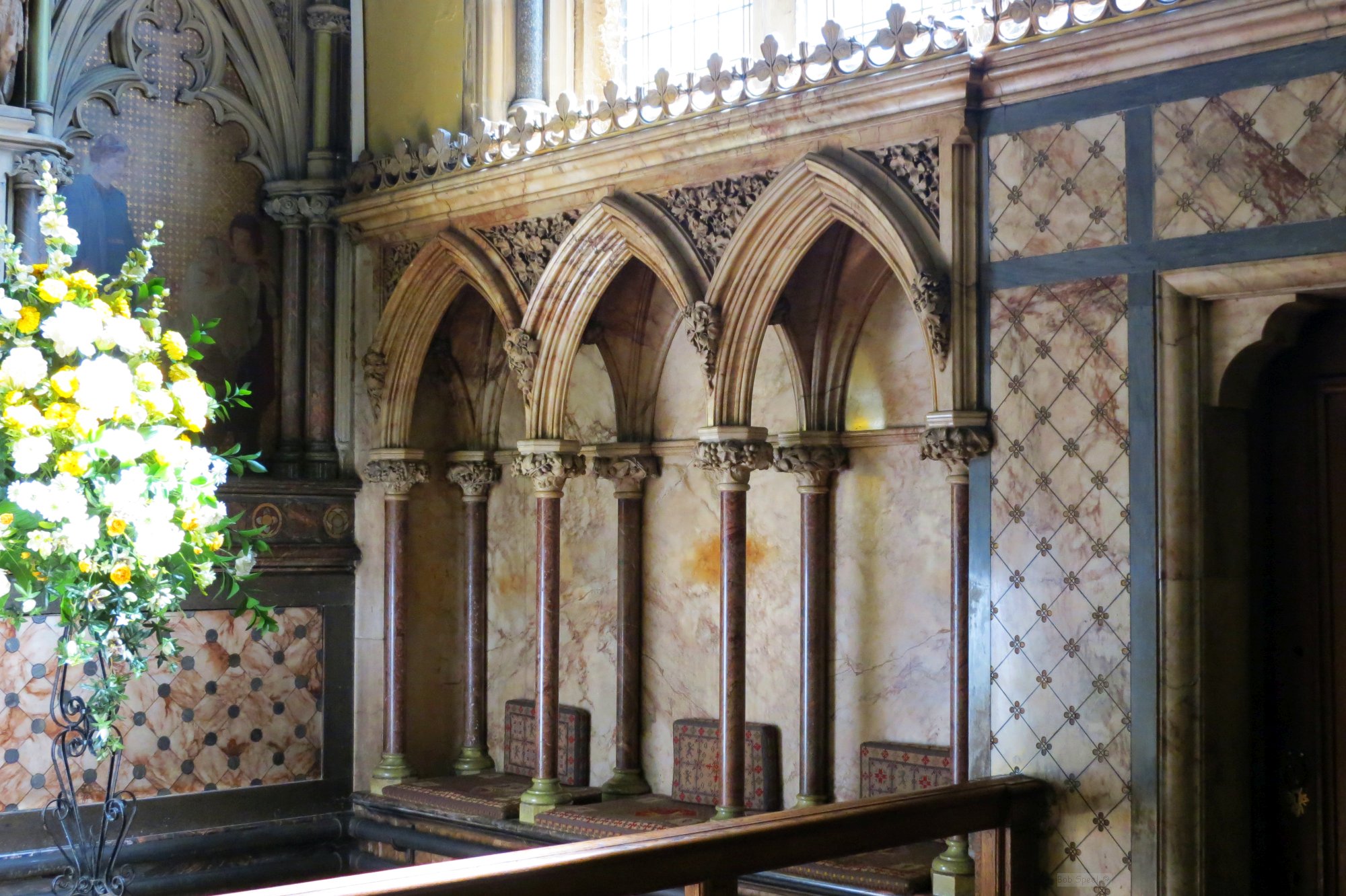
Chancel and sedilia.
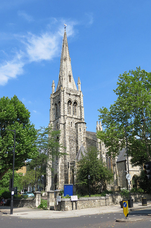
The Church was put up in the 1840s by the architect Thomas Cundy and his son, Thomas Cundy II, with a chancel by E. B. Ferrey in 1878, and a rebuild of the steeple (the main contribution of the younger Cundy) in 1955 after WW2 damage. The exterior is a handsome Gothic structure, with tall, crocketed (i.e. toothy) pinnacles, charming little roofs, and a rough stone with something of an excess over the usual amount of stone edging, which gives a varied texture and depth to the building once a goodly layer of grime has engrained itself on the less exposed parts of the surface. The main feature, however, is the tower, with its multi-sided stone steeple, sharply angular, on top, and this seems characteristic of Cundy churches, for St Michael’s Chester Square and St Gabriel Warwick Square and St Barnabas in Pimlico have rather similar towers - this tower survived the fire. Inside, the church was light and bright.
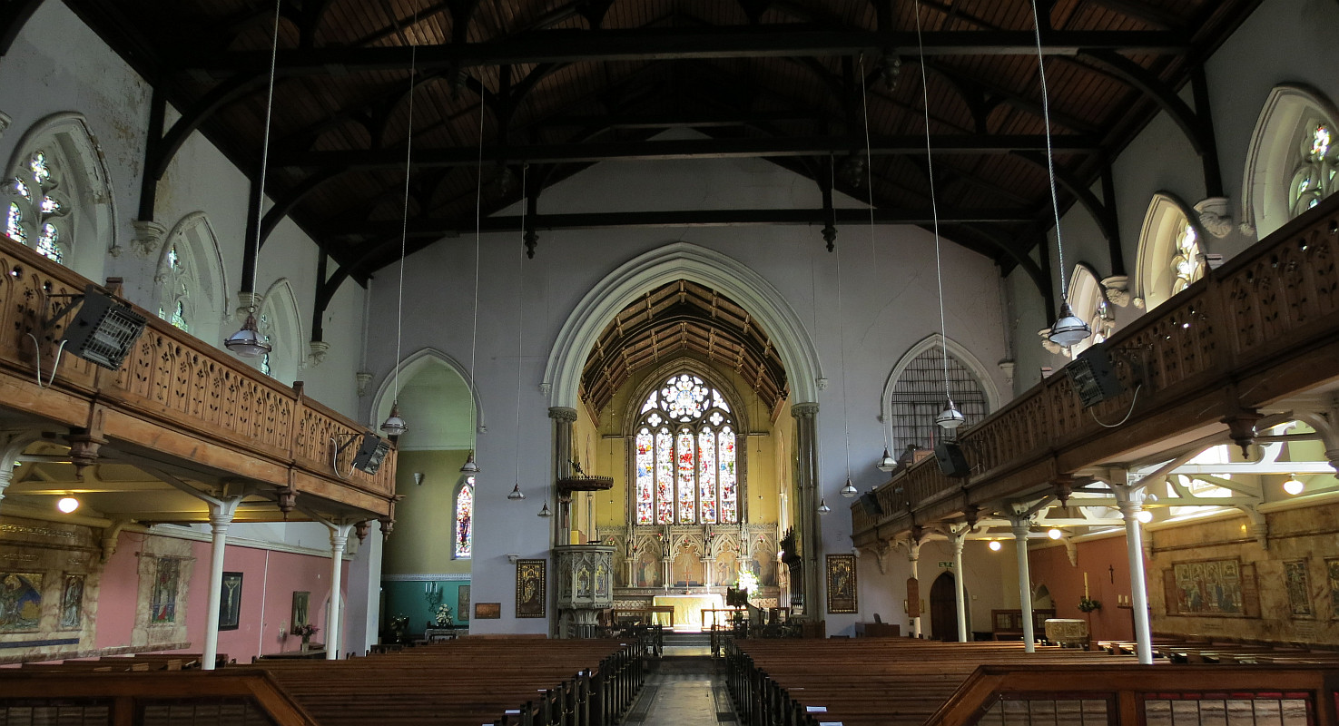
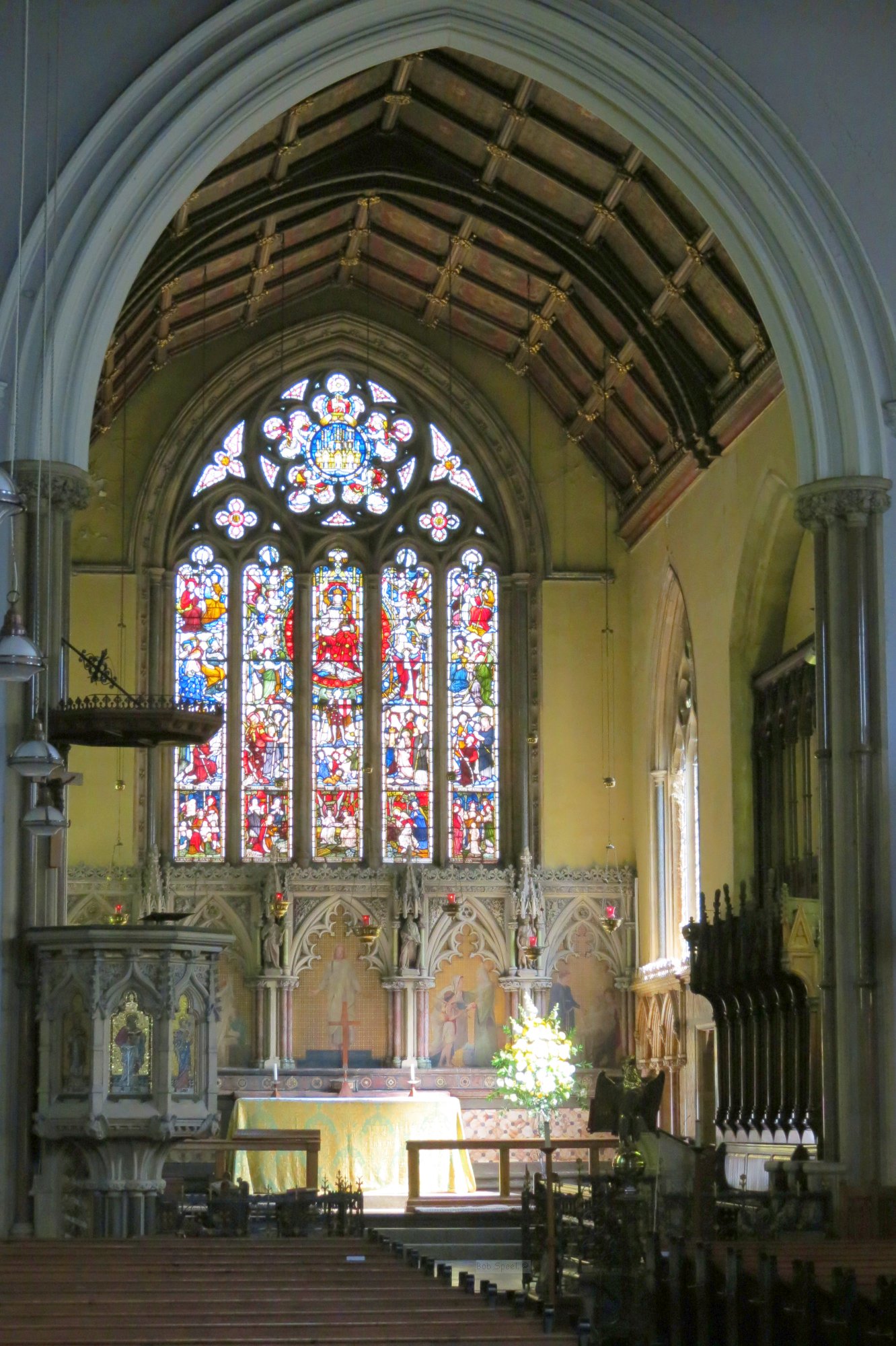
Interior of St Mark's, as it was.
Inside, we would not particularly expect a church of this date to have that much by way of monuments, unless it replaced an earlier church on the site, for marble monuments were already on the decline by 1840. But decorative schemes are another matter, witness the churches of Butterfield and GE Street, for example, and here the decoration and the modern monuments were combined in the form of mosaic.
Mosaic decoration in churches is not uncommon, and even extensive decorative schemes in mosaic can be found, for example in London are Westminster Cathedral (RC, not Westminster Abbey), the chapel in St Stephen’s Rochester Row, and the great mosaic after a design by G. F. Watts in St James the Less, Vauxhall Bridge Road. Outside of London, Leeds Parish Church springs to mind, and the baldachino of St Bartholomew’s Church in Brighton. Actual memorials decorated with large scale mosaic, however, are vanishingly rare, though minor mosaic decoration is found from time to time on small wall monuments from the 1880s, and again in Arts and Crafts work from around 1900. St Mark’s, however, has or had several monuments based around a mosaic picture. Added to this was a pulpit with six mosaic panels.
The memorial plaques are dated, thus we have the ages of the mosaics, with several around 1900, one from 1938, and one from 1944. The pulpit was Victorian, with commemorations at the base of the mosaics from the 1870s.
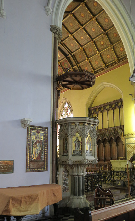
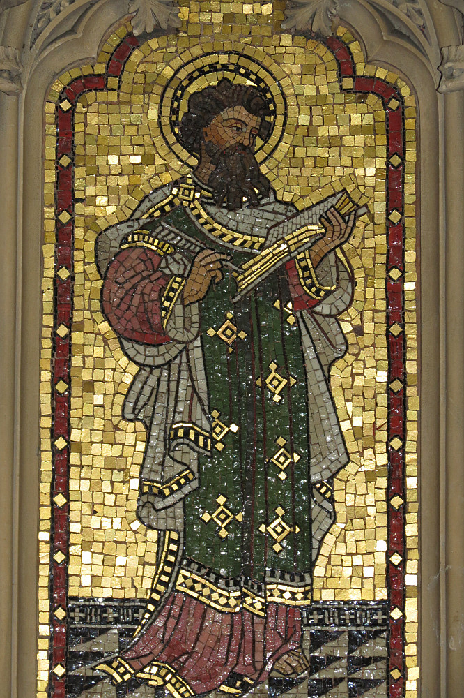
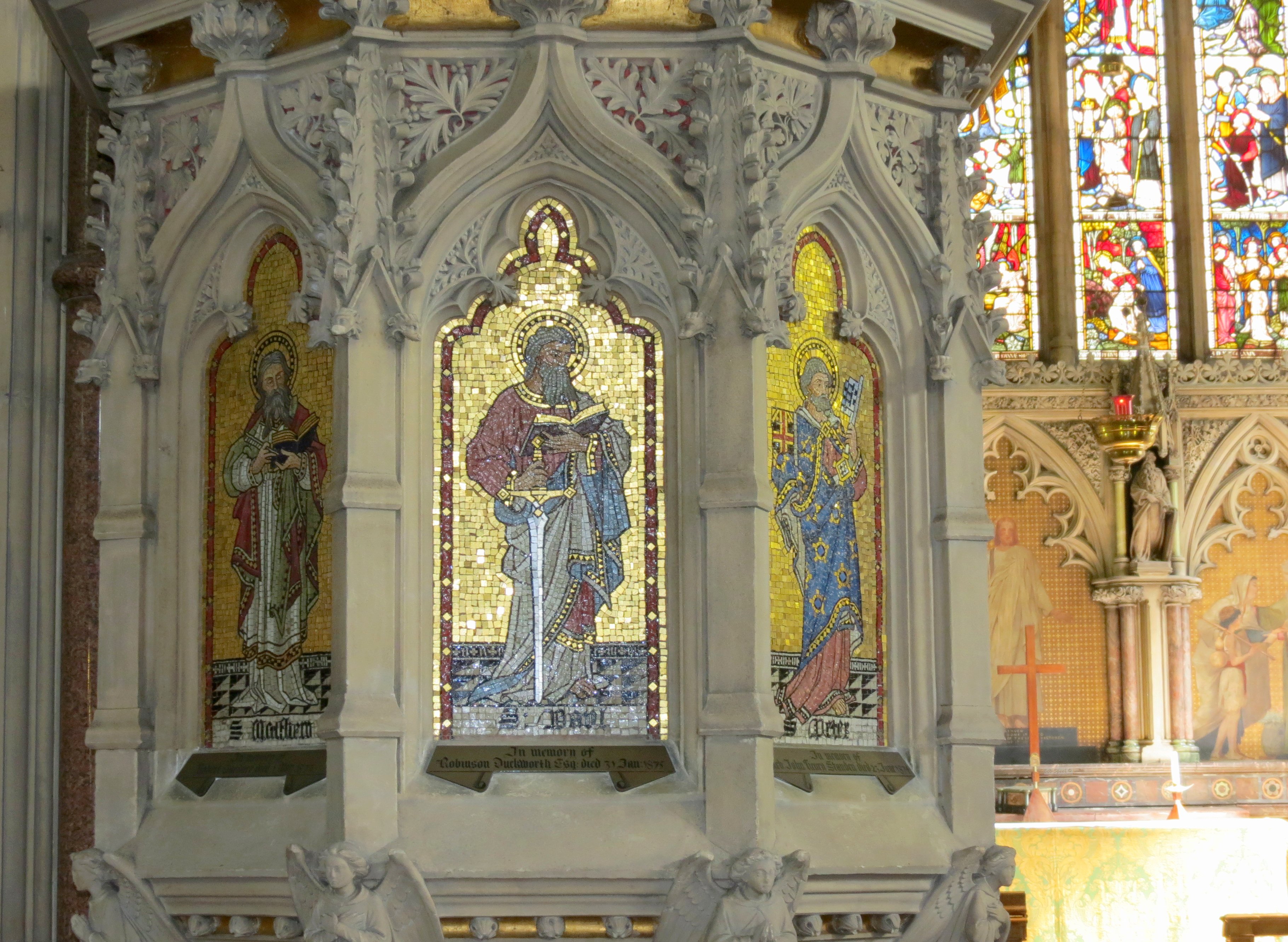
Pulpit mosaics, 1870s.
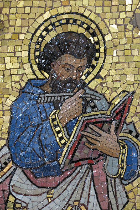
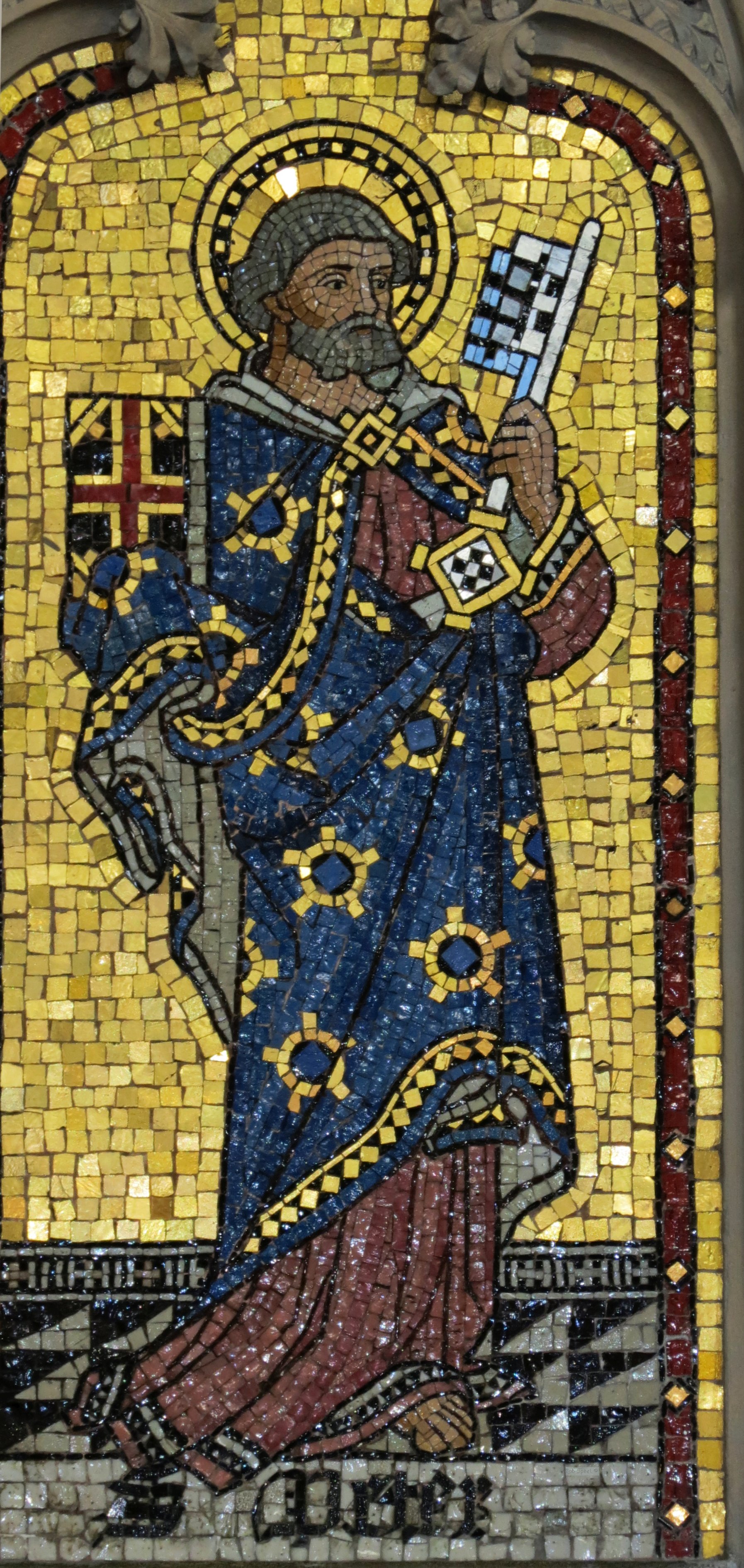
Pulpit mosaics: There are or were six of them, depicting saints, in conventional pose, that is to say standing, each in his own niche, with a gold mosaic background, and a depiction of a tiled floor at the base to root the figure so that there is no sense of free floating, and the Saint’s name. The material, as with almost all the St Mark’s mosaics, was Italian Smalti, and at the time the Pulpit was made, such mosaics would have come from the Salviati manufactury, though the actual artist is another matter. The proportions and treatment of the drapery of the figures was, as we would expect from Victorian times, very correct, but the treatment is rather simple, with the aim of high visibility and contrast even from a distance – as is appropriate for a pulpit, which is intended to provide a setting for the cleric delivering a sermon rather than to be examined closely. Thus the main areas of colour, hands and faces are outlined with thin black mosaic, and there is attention to the overall silhouette.
More of the Pulpit mosaics.
The laying of the mosaics was moderately traditional in the treatment of the eyes and the tendency, originating in Roman mosaics, to have a single line of mosaic which follows the exterior contours of the figure, which is distinct from the straight lines of the rest of the background, but the rest of the laying was purely Victorian. The mosaic designs were formed using a Reverse technique, which results in a completely flat work with no angling of the individual tesserae. The overall effect is illustrative, recalling the line drawings of the many books published by the Religious Tract Society, but this is not to take away from the technical skill of the mosaics, for example in the economical but perfectly expressed shape of the hands of St Mark.
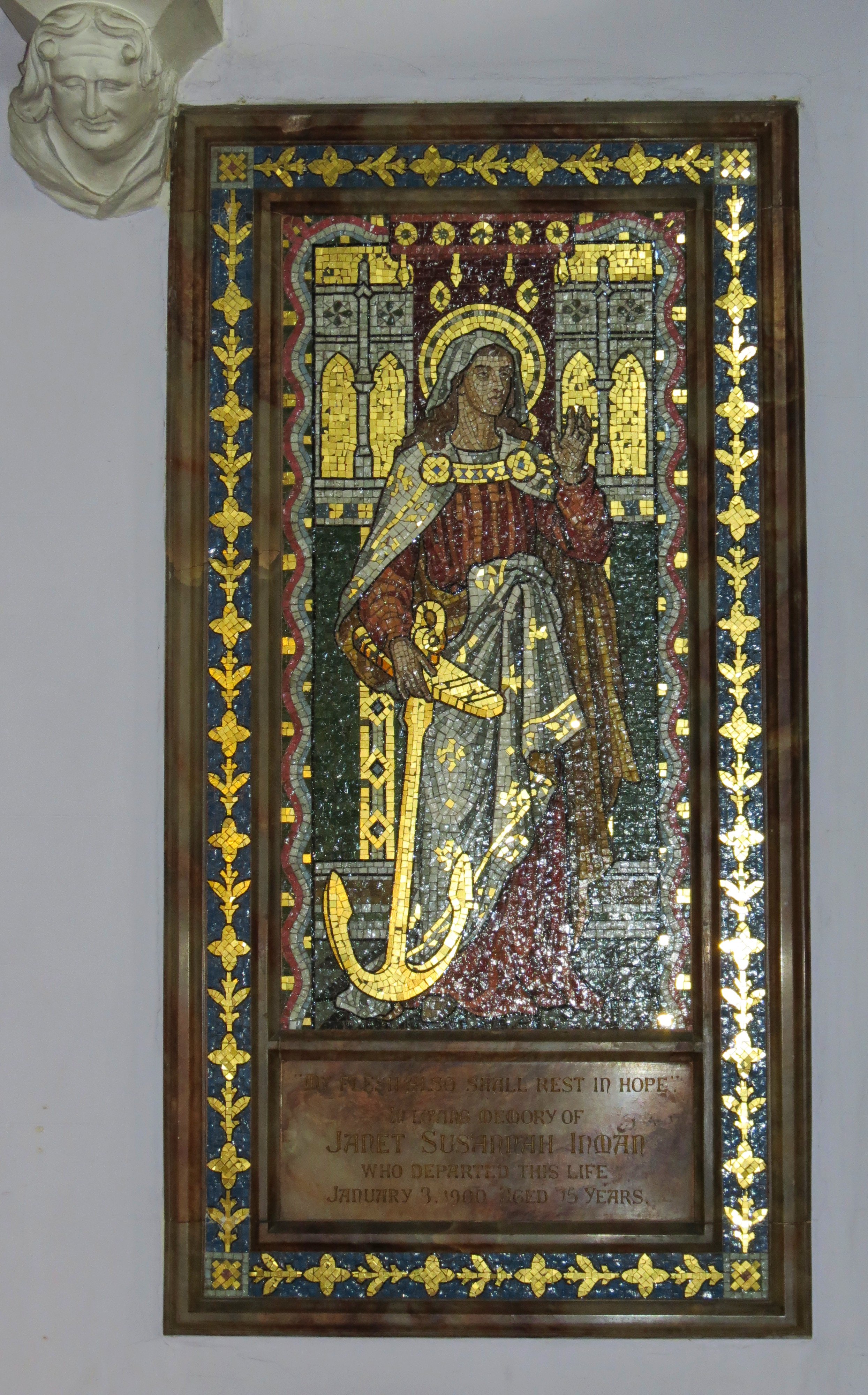
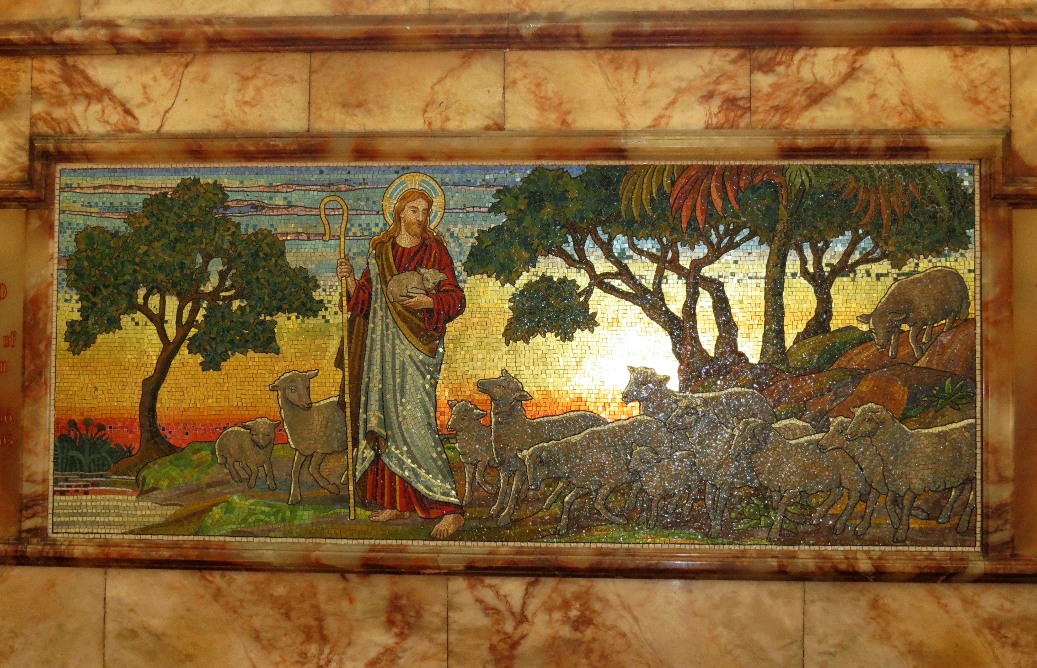
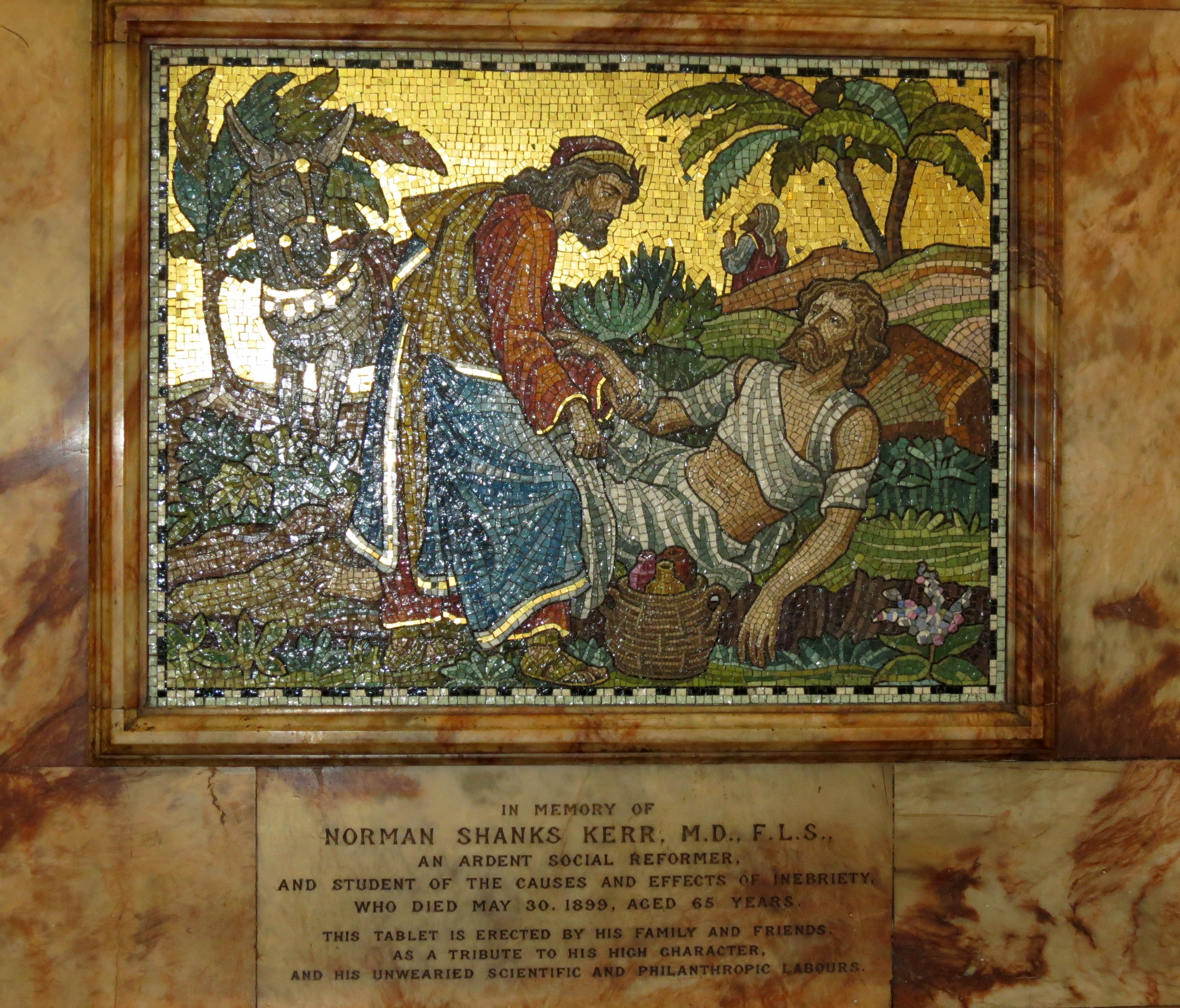
Inman, Drayson and Kerr mosaics, around 1900 (click to enlarge).
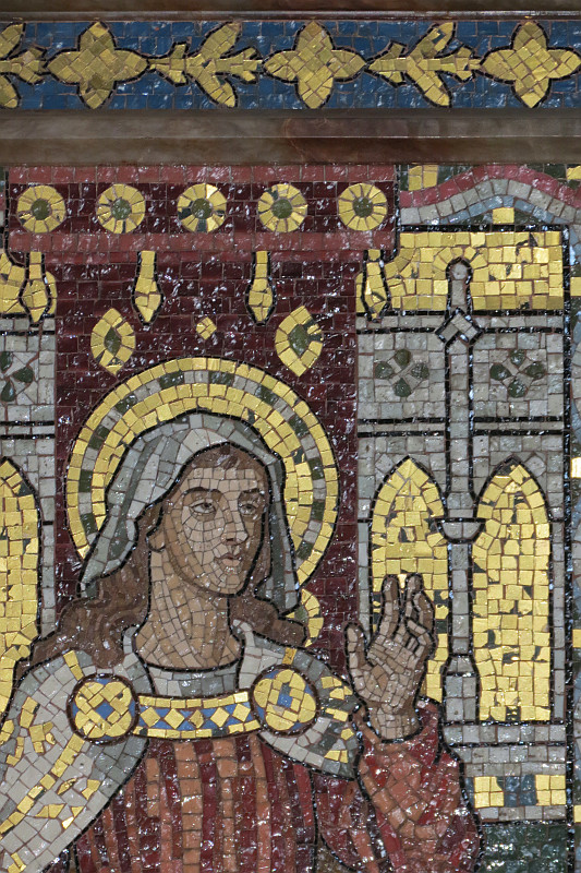
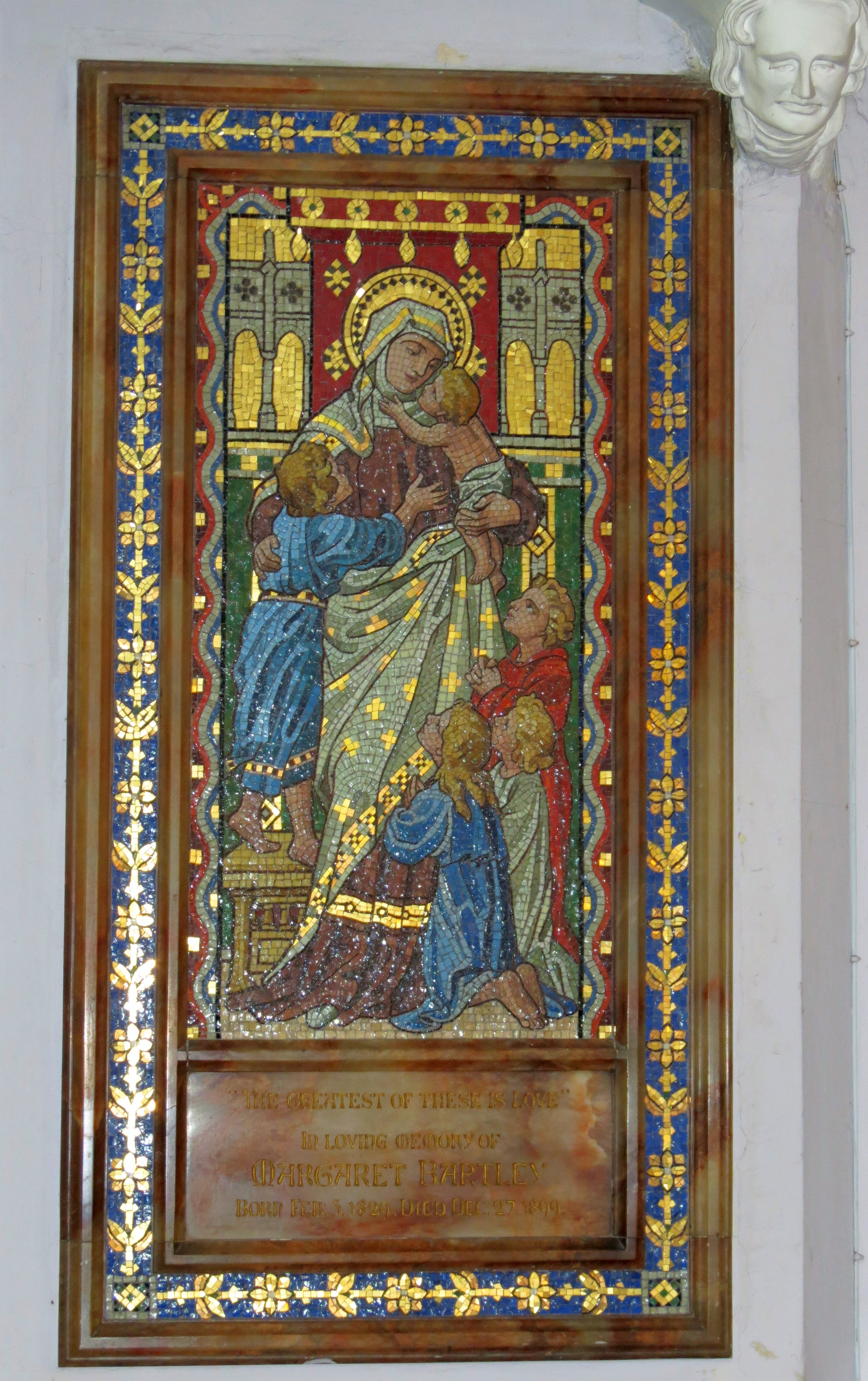
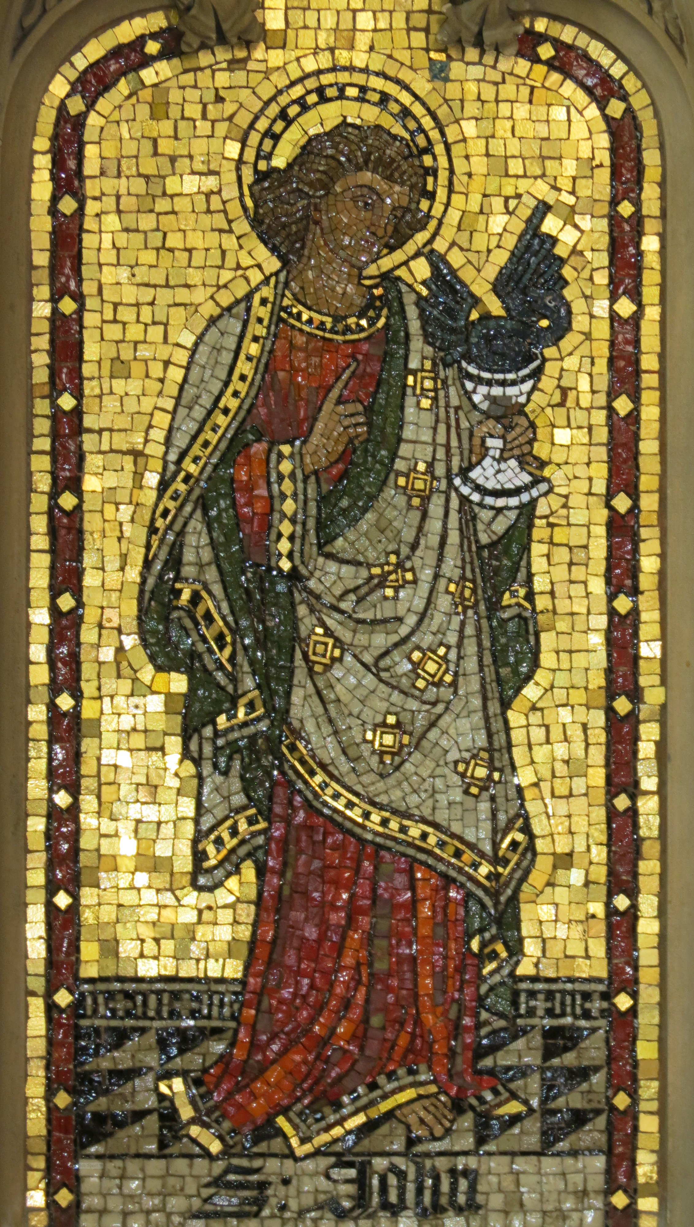
The earlier group of Memorial mosaics date or dated from 1899-1903. The panels to Margaret Bartley, Norman Shanks Kerr, Janet Susannah Inman and the long panel to Charles Dupin Drayson showing 'Christ as Shepherd' with a flock of sheep, all are in a similar technique to the Pulpit mosaics, and form a nice group in terms of variation on this style. The Bartley piece showed a female saint with several children gathered around her, three praying, two in her arms, and is rather sentimental for modern taste (see picture at top of page, click to enlarge). Note the softer, more rounded forms of the drapery compared to the Pulpit mosaics, and the rich effect of the multiple borders and more complex background. The Inman figure, above left, was a pair with the Bartley one, but the female face has more character and the use of the mosaics to show the changing surfaces is more sophisticated. The Kerr mosaic was a long panel showing the Good Samaritan, and thus had a group of two figures, with the figure who walked by in the background. The treatment of shade is much less careful, but here the emphasis is on texture, and there is a depth and perspective to the picture rather than the single dimension of the Bartley figure, which is a purely decorative treatment. The hands, faces, and exposed body of the fallen man are treated with much care, with the lines of mosaics used to show the musculature of stomach, arms and cheeks. There is thus much more solidity and character to these figures. The Drayson figure of Christ in a landscape with sheep is back to the illustrative, and although the picture is apparently three dimensional, the artist actually creates a single plain in front of the background, a device used with great sophistication by Alma Tadema in his paintings. Despite the date, this panel hearkens back to a Victorian sweetness (above centre, click for full picture).
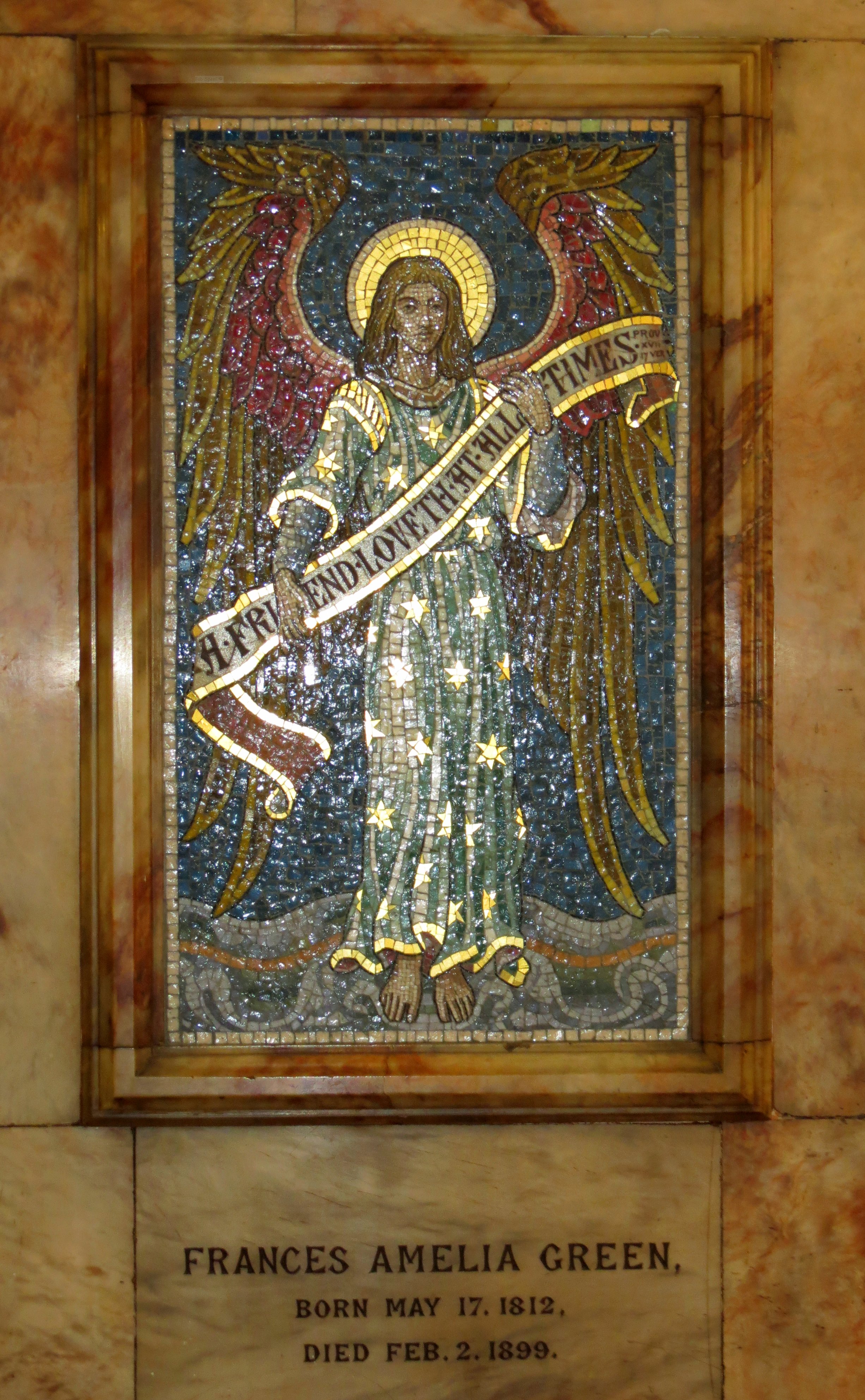
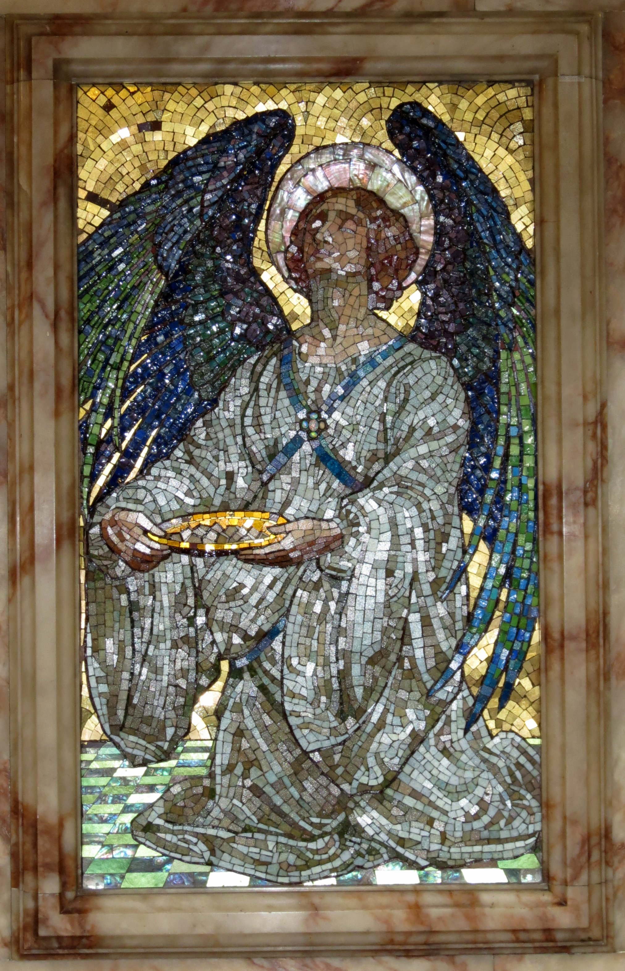
Frances Amelia Green, Arts and Crafts mosaic, 1899.
The Frances Amelia Green panel, also from 1899, is a contrast. Here was a clearly Arts and Crafts design, both in the choice of colours, and in the symmetry of the wings and the stars on the angel’s dress, the cut of the clothes and the curvaceous lines of the landscape on which she stands. Notice the free treatment of the hands and the loose hair, in contrast to the careful proportions of the previous pieces we have looked at. With a bright light of the right sort, an effect of glitter and precious jewelledness is obtained, dear to the heart of the Arts and Crafts artist. An enjoyable work.
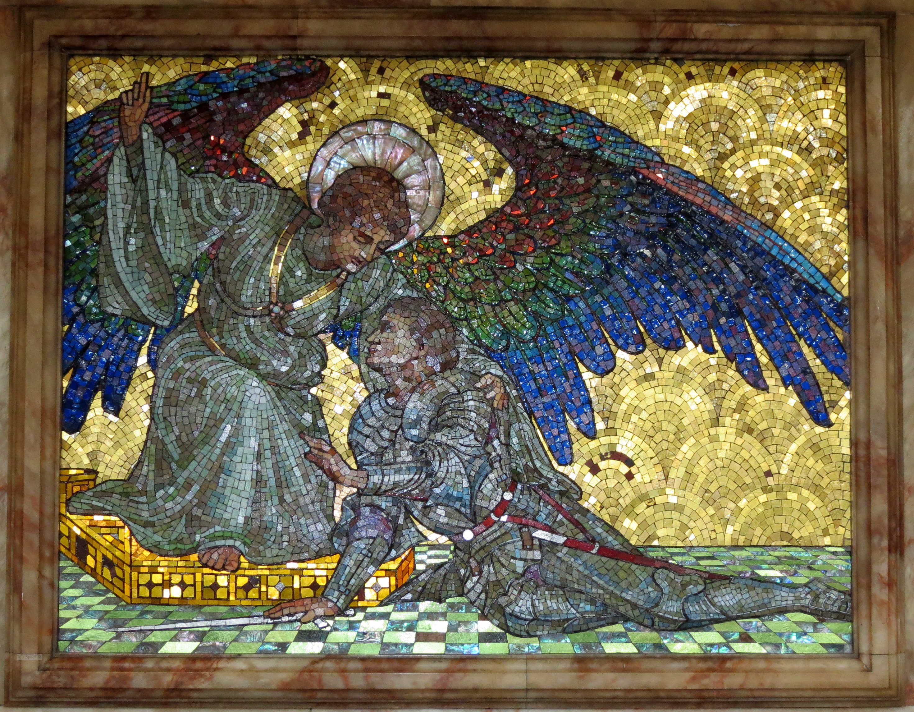
Panels from mosaic to Revd. Charles Erskine, d.1905.
The triptych to the Revd. Charles Erskine, d.1905, was again Arts and Crafts, but the treatment could not be more different. This really is a remarkable use of mosaic, with a sophisticated cutting of the tesserae in multi-sided shapes for the heads and parts of the wings of the angels which avoids lines of mosaic in favour of a much freer treatment. The tight packing of the dark coloured mosaic of the wings gives an iridescent, jewelled effect, and this is combined with the use of larger pieces of mother of pearl for the halo and flooring, Opus Sectile if you will. It is hard to imagine such an intensity of colour and depth and movement being conveyed in other materials or in paint. The resting knight in the central panel wears an imaginative spiky armour which recalls the Art Nouveau of the sculptors George Frampton and Alfred Drury. A truly exquisite piece - do click to enlarge and see the detail.
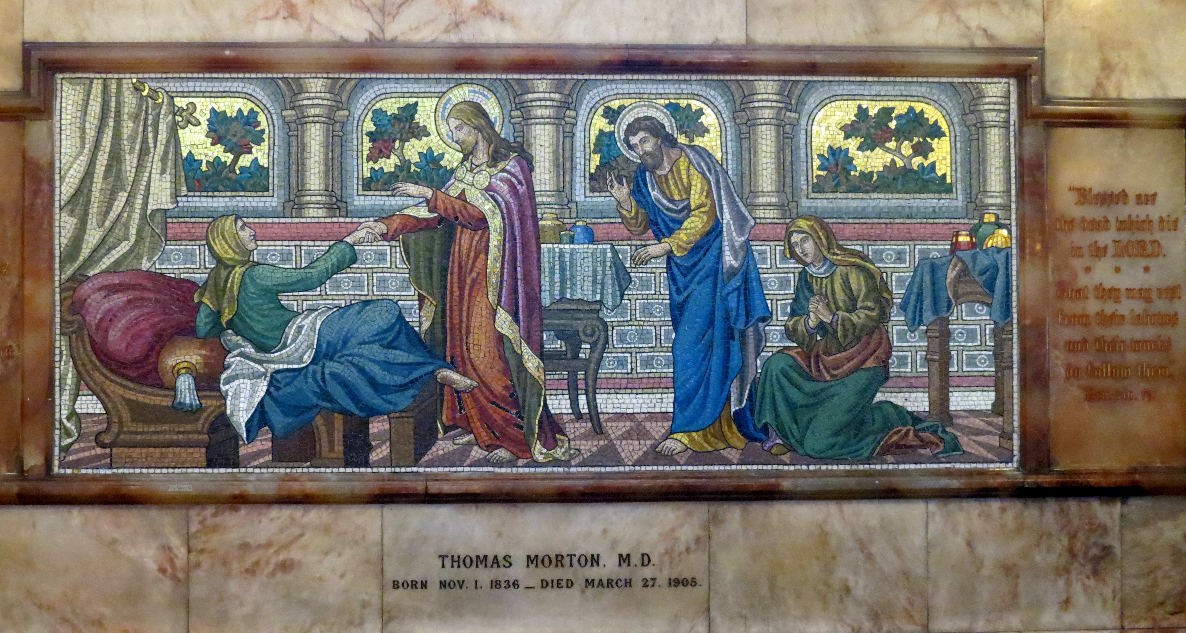
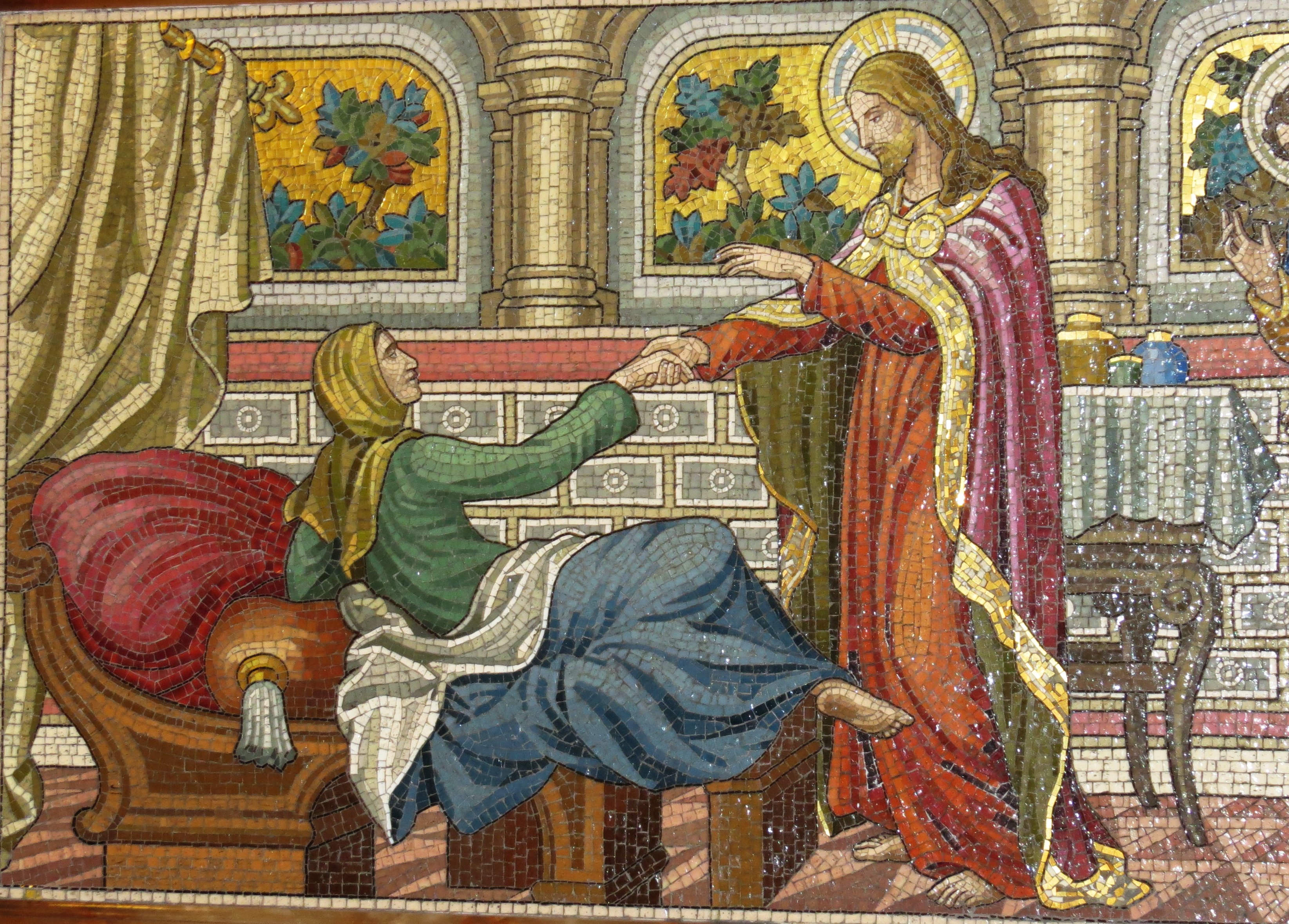
Medieval composition mosaic to Thomas Morton, d.1905.
The mosaic to Thomas Morton, d.1905, another long panel, is less exciting, but interesting in that the composition is so very medieval, with an interior view, two groups of figures, carefully studied furniture on a tiled floor, and a back wall punctuated by pilasters separting windows with trees outside in a golden light. I particularly like the chaise longue, with its tasselled cushion of the same type so familiar from our 16th Century kneeler monuments. This picture - the full one on the left - is taken without reflection, and look how flat and lifeless it becomes.
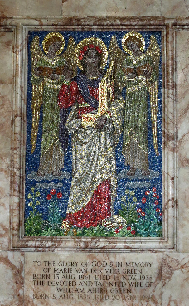
Marie Van Der Veer Green, d.1938.
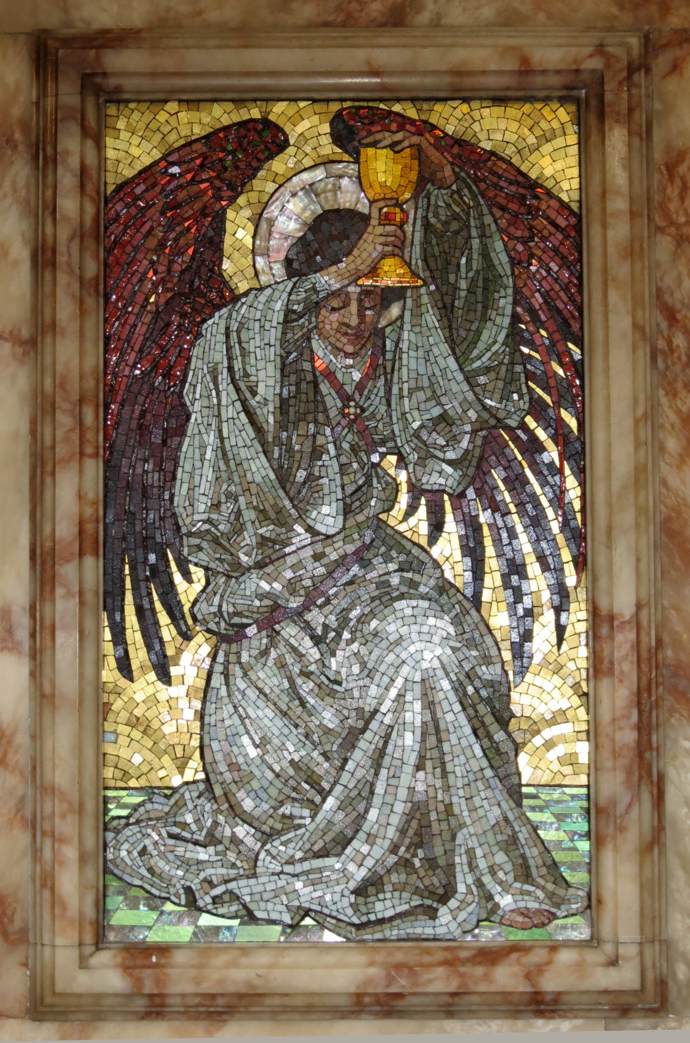
Now the mosaic panel to Marie van der Veer Green, d.1938, a generation later, and here the mosaics were used differently again. Again we see how the Italian smalti can give an intensity of colour matched by no other material, and this is an extraordinarily sophisticated work of its type, with the use of lines of similarly coloured mosaic to emphasise the brightness of the central figure’s red dress and purple scarf, and the lines of gold across the white overcloak giving a shimmering surface. Parts of this panel look to have been laid directly, or using a double reverse method to angle the tesserae slightly; the different angles of each piece reflects the light in all directions, giving a sparkling picture of a type much used some hundreds of years previously by the Byzantines. And yet the three girlish faces, the flowers in the central figure’s hair (she is St Cecelia), and the line of brightly coloured flowers at the base all hearken to the 1900s rather than the 1500s.
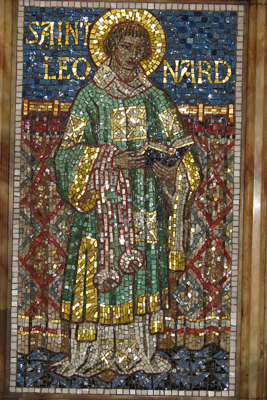
Revd. Joseph Hobling, d.1944.
Finally, the most recent mosaic was that to Revd. Joseph Hobling, d.1944, killed while ministering to fellow prisoners of war in Germany. This shows St Leonard, appropriate for this memorial as one of his miracles was that prisoners who hearkened to him were freed of their chains. We return here to a single standing figure with a decorative, flat treatment, emphasised by the Saint’s name in gold against the background. The robes of the figure are very simply treated, more detail being given to the curtain in the background. Again, we have a setting of the mosaics to catch the light by virtue of their different angles, and despite the modern aspect to the face – which is however most characterful – this has the feel of an artist trained in and with an empathy for traditional methods; Eastern European, I would hazard rather than English or Italian.
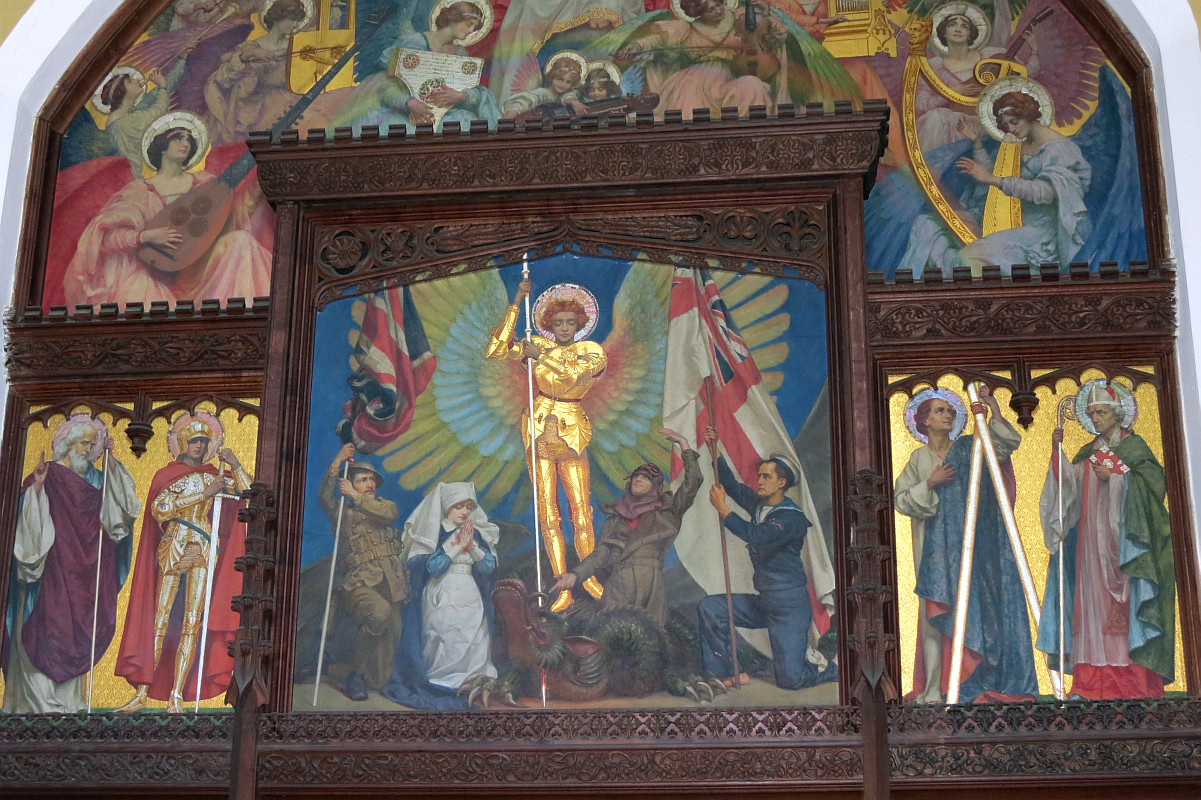
War memorial murals designed by Sigismund Goetze.
A brief note on the other contents of the Church. There was much fine alabaster and stone work, in later Victorian and Edwardian vein but confidently in Medieval style. The reredos had paintings by Edward Armitage, Victorian in spirit but modern in the actual figures, and with little saints under Gothic canopies which look like 1860s High Church work by someone like Powell and Sons; the carving of the leafy spandrels is very fine. The font is Victorian, but by someone who knew his Medieval fonts. And in a side chapel of the Church was a War Memorial taken from a demolished church, with painted panels designed, apparently, by Sigismund Goetze, but looking for all the world like the work of the Victorian child painter, T. C. Gotch. Excellent female angels playing musical instruments, in pastel colours and with harmonious lines to the composition.
Report of the fire in the Evening Standard on 28 January 2023.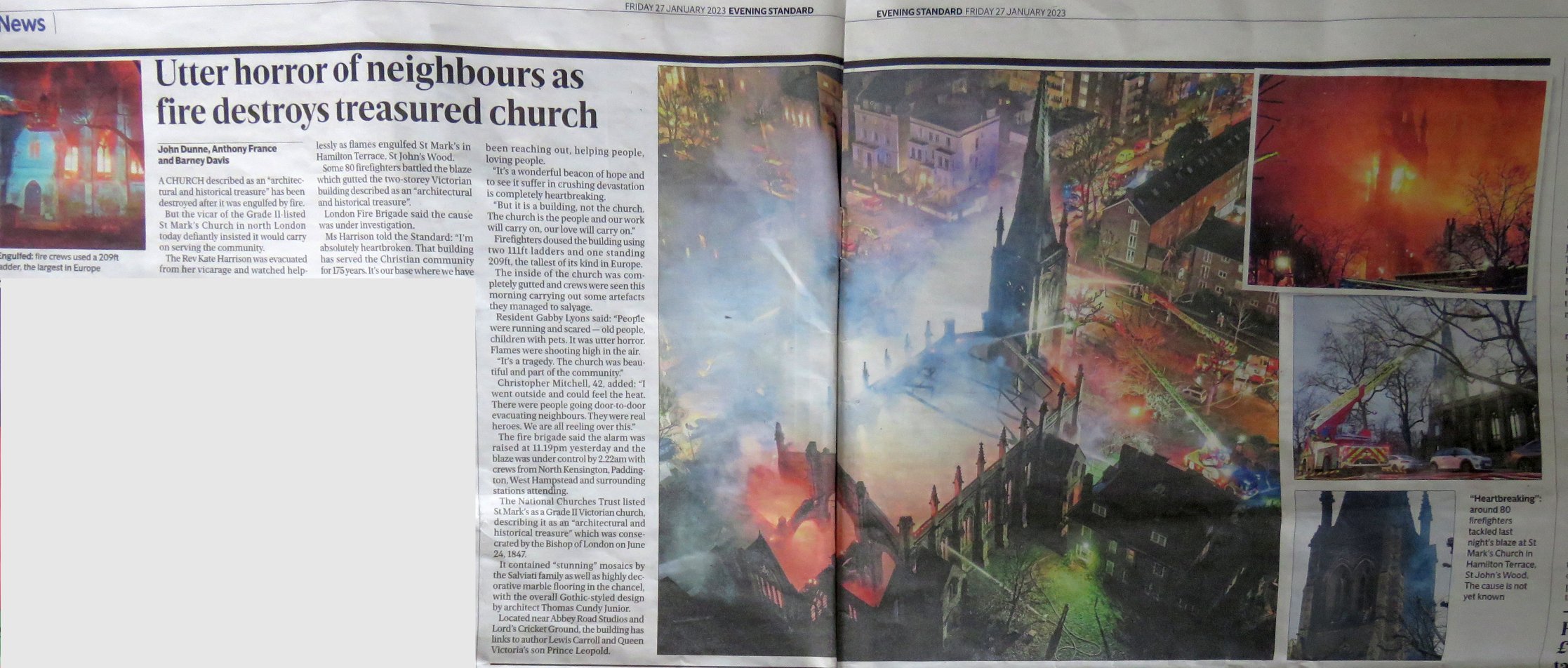
The picture above is taken from the Evening Standard the next day, pictures online show the tower standing and fallen out windows; we can only hope that at least something of the mosaics might have survived within the rubble, despite all, but I fear the heat will have been too great.
Some more pictures are on this page.
The Church website is at https://www.stmarks.london/